MIT GROUP: Together, more and more creative and technological
HIGH CONNECTION WITH TECHNOLOGY AND INNOVATION
We design, engineer, and build machines and systems with innovative and transversal technologies, which implement thermal transformations, robotic movements, vision and control systems also in AR. We can manage complex processes by formulating optimized solutions.
We design, engineer, and build machines and systems with innovative and transversal technologies, which implement thermal transformations, robotic movements, vision and control systems also in AR, specific for the environmental sector.
We support you in conducting analyses, experimental tests, and research orders to develop your industrial project from TRL1 to TRL7, thanks to an in-depth specialization in electrothermal and the support of our Technology Experience Lab.
Tydock Pharma srl, based on a twenty-year experience in the field, is a leading player in the field of pharmaceutical research.
Agrifood Unit, through the approach based on Open Innovation, studies the different aspects that characterize the research of agri-food transformation processes, thanks to collaboration with professionals, universities, specialized companies and international research institutions.
Supports at regional level the technological response to the development of food production processes.
Teknoinvest d.o.o. is an investor hub, dedicated to the development of companies and spin-offs with high technological added value.
EPL is a non-profit group to support global sustainable development, connecting academic and industrial entities around the world.
In the brand the value,
the philosophy and many ideas
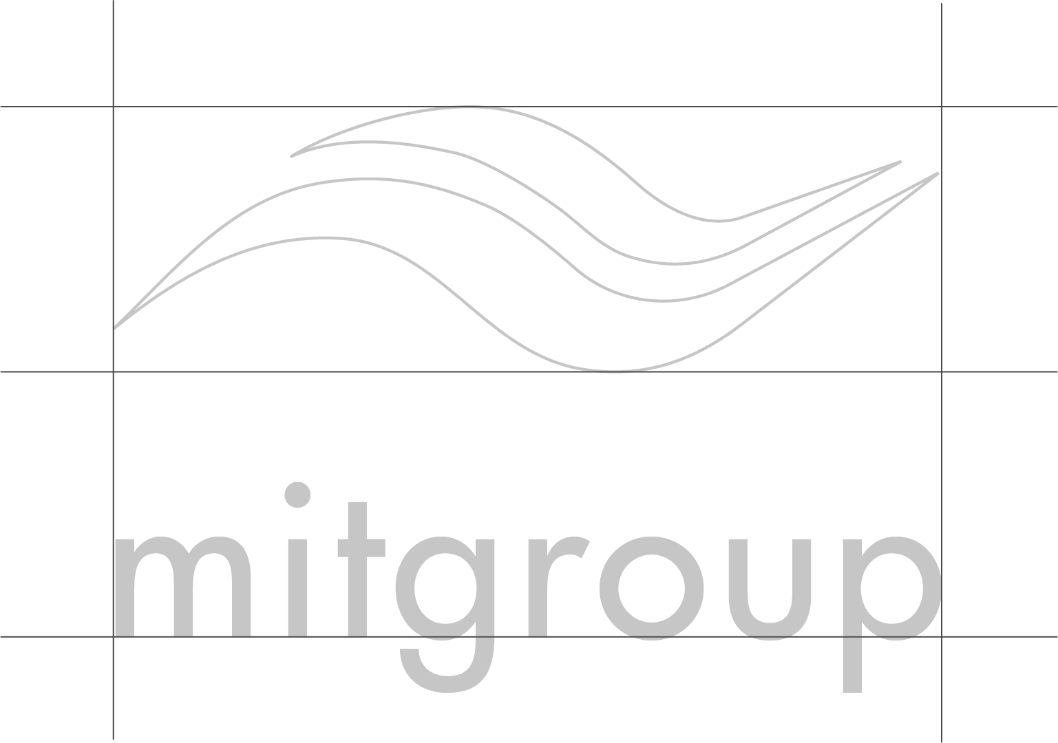
A logo composed of waves, born together with
Microglass srl, the first company founded in 2001
For more than twenty years, the logo has recalled electromagnetic waves, the technology at the basis of our technological platform declined at an industrial level. A continuous motion through the development of application techniques, touching the most disparate production sectors, which has allowed us to increase skills that we disseminate transversally.
The logo is composed of waves and it reflects the movement of our innovative nature and the fluidity of our multidisciplinary soul.
A clear and rational font to communicate a functional technology
Presented for the first time by the Bauer Type Foundry in 1928, Futura is commonly considered the main development of the typeface coming out of the constructivist orientation of the Bauhaus art and design movement in Germany, a fundamental reference point for all innovation movements in the design and architecture field linked to rationalism and functionalism, part of the so-called Modern Movement.
Paul Renner (character designer, painter, author and teacher) based the original drawings on the simple shapes of circle, triangle and square. Futura is timeless modern; in 1928 it was striking, tasteful, radical and today continues to be a popular typographic choice for expressing strength, elegance and conceptual clarity.
CONTACT US
We will be happy to help you find the solution that best suits your needs.